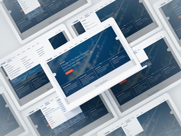
Ideagen Navigation Redesign
Using data and analytics to make informed structure and design decisions.
The Brief
During the weeks and months following the launch of a full website re-design, we kept a close eye on our user behavioural data (using CrazyEgg monitoring) and Google Analytics data and noted improvements that should be made to improve user experience and conversion rates.
A number of key learnings were taken from this user research, including:
- General users were unfamiliar with the style of vertical navigation we had implemented
- Important, high traffic content wasn't easily accessible
- Site search was under-utilised and not very intuitive
- Long scrolling lists for larger sections were inhibiting quick scanning of options
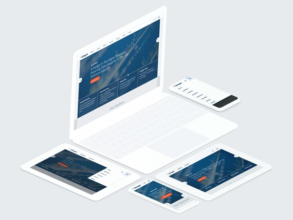
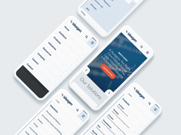
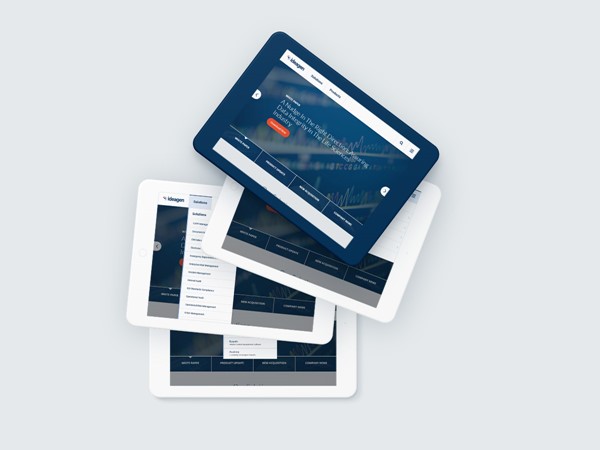
From these findings, we created a detailed list of changes, with the aim of improving user experience, site performance and conversion rates for product demo requests and general enquiries. These changes included:
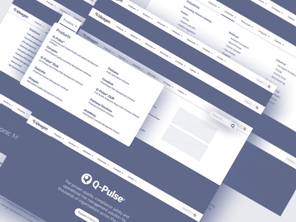
- Switching to a more conventional. horizontal navigation to alleviate user anxiety and unfamiliarity - a barrier to a good user experience
- Re-ordering navigation items to allow the more heavily trafficked pages to be found quickly
- Re-positioning site search and changing it's design to a simple input box/submit button combo
- Introducing featured content banners to help push marketing campaigns and drive conversions
The resulting data recorded after the update showed great improvements in:
- Site traffic +14%
- Bounce and exit rate -2%
- Converstion rate +10%
Tools & Technology Used


