Mercury Press & Media
Branding Project
The Brief
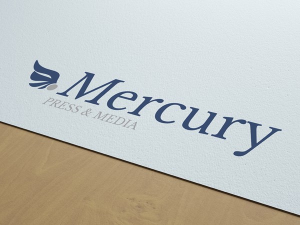
Mercury Press and Media have been at the forefront of covering news for the UK national and international press for the past 40 years and they got in touch to help them bring some new life to their corporate logo.
The brief for the design had a two strict criteria:
- Maintain a reference to the old colours - don't deviate too far from the existing palette
- Keep the existing format of leading with 'Mercury' and 'Press & Media' forming the subtext
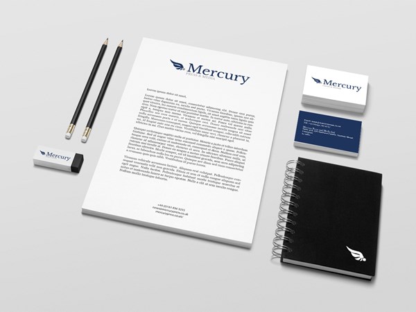
A new wing design was created to sit alongside the logotype and provide flexibility for branding options - the wing shape could be used as a photo watermark or avatar on Twitter, for example.
A new typeface was also proposed, with Libre Baskerville winning the vote out of a selection of 3 others.
Tools & Technology Used


